top of page

Updated: Sep 29


The years after the quartz crisis are to me, one of the most fascinating chapters in watchmaking. Having survived what once looked like an existential threat, the mechanical watch emerged with a new role. By the 1980s, a small group of watchmakers and entrepreneurs were recasting it not as a necessity, but as an expression of craft, culture, and increasingly, mechanical spectacle. That shift produced its own unlikely heroes.


Among them were Jean-Claude Biver, Daniel Roth, Roger Dubuis, Franck Muller, Kurt Klaus and Gerd-Rüdiger Lang — the German watchmaker and chronograph specialist who founded Chronoswiss in 1983. Lang recognized early that the mechanical watch’s obsolescence could become part of its appeal. The Régulateur embodied that idea: it became the first serially produced regulator wristwatch taking the old regulator clock arrangement and one of the first wristwatches with a display caseback¹, turning traditional mechanics into something meant to be seen.


The Chronoswiss Régulateur (1987) and the Opus (1995) each fitted with their respective OEM bracelets. Photo Source: Ode to Chronos Instagram

By the 1990s, watches no longer needed to justify their existence; they could celebrate complexity for its own sake. In 1995, the Chronoswiss Opus captured that zeitgeist perfectly, skeletonizing an automatic chronograph and making its gears, levers, and bridges the visual focus. If the Régulateur defined Chronoswiss in the aftermath of the quartz crisis, the Opus carried the brand into a more theatrical decade when the mechanism itself became the design.


Skeletonized chronographs with "Kairos" name. Photo Source: Europa Star Issue 212 and Le Colezioni Orologi Meccanici Piu' Prestigiosi del Mondo Issue 1996.

But the Opus did not emerge from a vacuum; it appears to have evolved from the Kairos Chronograph introduced in 1991. At least three documented skeletonized C.741 examples carried the “KAIROS” name while already showing the movement architecture associated with the early Opus. Whether they reached regular production or remained catalog, prototype, or pre-production pieces is unclear, but the archival evidence points to the concept being developed within the Kairos line before gaining a name of its own.


Chronoswiss Opus in Stainless Steel. Photo Source: Le Colezioni Orologi Meccanici Piu' Prestigiosi del Mondo Issue 1996.

The Opus came in a compact 38 mm round case, distinguished by Chronoswiss’s signature coin-edge bezel, straight lugs, and oversized onion crown, offered in stainless steel (CH 7523 S), two-tone (CH 7522 S R), full gold (CH 7521 S), and a limited edition in platinum (CH 7520 S). Its dial was reduced to floating subdials, each with a distinct function. At 12 o’clock, the register records chronograph minutes; at 6 o’clock, it records chronograph hours. The 9 o’clock register displays running seconds for the timekeeping function, while the 3 o’clock register carries the pointer date. In 1995, the Opus became the world’s first serially produced skeletonized automatic chronograph².


The transparent caseback continued the effect from the rear, revealing the ETA 7750 base movement almost in full. At the time of its release, the Opus was priced in leather strap at 9.800.000 lire (≈ $6,000 USD) in stainless steel, the full gold at 19.800.800 lire (≈ $12,150 USD) and the two-tone at 14.800.000 lire (≈ $9,100 USD)³. The platinum price, however, was only available at request.


Opus in Platinum introduced in 1997 and limited to 50 pieces. Photo Source: Europa Star Issue 222


A closer examination of surviving examples suggests that the watch evolved considerably more than its largely unchanged appearance might imply. Based on over 60 documented Opus examples, I have created a dataset and identified six distinct generations of the front-visible skeletonization architecture, classified according to recurring structural differences observed around the 3, 6, and 9 o’clock subdial registers.


The exact dates of these Generations remain estimates rather than confirmed factory production periods, but the sequence itself is clear: the Opus was not built around a single static skeletonized movement, but refined through a series of incremental production changes over its lifetime.


Generation I: The Beginning


Generation I represents the earliest known execution of the skeletonized C.741 and established the visual language that would define the Opus. In the dataset, it is identified by the 3-I / 6-I / 9-I configuration and appears from the earliest documented examples through serial No. 13XX, suggesting a production period from roughly year 1995 to 1997/98.


Its skeletonization is especially distinctive around the three lower registers (See video above). At 3 o’clock, four spokes radiate from a central hub in a wheel-like pattern. At 6 o’clock, the geometry gives way to a softer, more organic form, with two sweeping curves creating a layered, wave-like opening. The 9 o’clock register is the most asymmetrical of the three, defined by a curved bridge that sweeps across the lower half of the subdial and curls around a small central pivot. 


Chronoswiss Opus Gen 1 bracelet. Photo Source: Gray & Sons

Although most examples are found on leather strap, the Opus was also offered on a beads of rice bracelet, giving the watch a more integrated and distinct character. Its small, rounded links create a supple, jewelry-like texture, while curved end links tuck closely between the lugs for a seamless transition from case to bracelet.


Only four out of the twenty Opus Gen 1 examples documented in the dataset are fitted with bracelets, suggesting that it was a relatively uncommon choice at the time. Gen 1 bracelet most distinctive feature is the narrow locking arm blade clasp at the center, which has a round medallion with the Chronoswiss logo.


Generation II: The First Revision


Generation II marks the first clear production change in the Opus skeletonization. In the current dataset, it is defined by the 3-II / 6-I / 9-I configuration and appears from approximately serial No. 15XX through 21XX, suggesting a likely production period of around 1997/98 to 1998/99.


The key change occurs at 3 o’clock, where the first-generation wheel-like structure gives way to a new, H-shaped design. The 6 o’clock and 9 o’clock registers remain unchanged from Generation I, retaining the same flowing, asymmetrical forms. This makes Generation II particularly important because it shows that Chronoswiss was revising the skeletonization incrementally rather than redesigning the entire movement at once. All normally sequenced Generation II examples in the dataset are still marked C.741, which places this generation before the later C.741S designation.


Generation III: The Major Shift


Generation III marks the most substantial early revision of the Opus skeletonization. In the current dataset, it is defined by the 3-II / 6-II / 9-II configuration and appears from approximately serial No. 22XX through 40XX, suggesting a production period of roughly 1998/99 to 2003/04.


Unlike Generation II, where only the 3 o’clock area changed, Generation III introduces new design at both 6 and 9 o’clock while retaining the revised 3 o’clock structure. At 9 o’clock, the 9-II configuration replaces the earlier curved lower bridge with a more angular, diagonal structure that cuts across the register. The 6 o’clock register changes to 6-II, characterized by a much more radial, multi-spoke skeletonization pattern. This generation therefore represents the point at which the Opus moved beyond a single isolated modification and into a broader redesign of the front-visible skeletonization.


Generation III is also significant because it spans the transition from C.741 to C.741S. No. 22XX already shows the full Generation III architecture while still carrying the earlier C.741 designation, whereas No. 23XX is marked C.741S with the same configuration. This demonstrates that the architectural change preceded the caliber name change on the dial rather than occurring simultaneously.


Gen 2 bracelet showing the improved double-deployant clasp design. Photo Source: Watch Vault

Another change that begins to appear with Opus Generation III is the introduction of the Generation 2 bracelet design. The Gen 2 bracelet retains the multi-link construction of the earlier design but adopts an improved double-deployant clasp. The clasp folds symmetrically from both sides and meets at a central partition point, where a round Chronoswiss logo medallion provides the main visual identifying detail. Release is handled by a twin-trigger mechanism, with pushers on both sides of the clasp allowing both folding sections to disengage.


Compared with the earlier clasp, the Gen 2 design appears more mechanically defined and functionally explicit, while still preserving the same bracelet’s continuous, jewelry-like appearance of Gen 1.


Generation IV: A Focused Revision


Generation IV represents another incremental step in the Opus’s evolution. In the current dataset, it is defined by the 3-II / 6-III / 9-II configuration and appears from approximately serial No. 41XX through 44XX, suggesting a likely production period around 2003/04 to 2004/05.


The defining change is concentrated at 6 o’clock. The 3 and 9 o’clock architecture remains unchanged from Generation III, while the lower register adopts a new Type III structure defined by a simpler three-arm structure radiating from the center.


All documented Generation IV examples are marked C.741S, and its relatively narrow serial range suggests it was a short-lived transitional generation, bridging the long running Generation III architecture and the more extensive revisions that would follow in Generation V.


Generation V: Final Transition


Generation V continues the Opus’s step-by-step refinement. In the current dataset, it is defined by the 3-III / 6-III / 9-II configuration and appears from approximately serial No. 44XX through 49XX, suggesting a likely production period around 2004/05 to 2005/06.


The defining change occurs at 3 o’clock, where the Type II architecture gives way to a new Type III form with curved arms around the central pivot. The 6 o’clock register retains the Type III structure introduced in Generation IV, while the 9 o’clock register remains unchanged at Type II. Its relatively narrow serial range suggests another short-lived transitional phase, leading directly to Generation VI, when the 9 o’clock register would receive its final major revision.


Generation VI: Final Architecture


Generation VI represents the final and most developed form of the Opus skeletonization documented in the current dataset. It is defined by the 3-III / 6-III / 9-III configuration and appears from approximately serial No. 50XX through 66XX, suggesting a production period beginning around 2005/06 and continuing into the late 2010s.


The defining change occurs at 9 o’clock, where the remaining Type II structure is replaced by the final Type III were the bridge evolves into a broader, more open double-arm structure that sweeps across the register. With that revision, all three visible register areas adopt their third generation forms, completing the progression that had unfolded incrementally across the previous generations.


Compared with the shorter transitional Generations IV and V, its broader serial range suggests that Generation VI became the stable, mature architecture of the later Opus.


The original 38 mm Opus remained in production into the late 2010s, spanning nearly the entire Gerd-Rüdiger Lang era at Chronoswiss. Lang led the company until 2012, when he sold it to the Ebstein family, bringing the brand’s founding chapter to a close. After a period of absence from the catalog, the Opus returned in 2020 with a redesigned 41 mm case and shorter lugs.


The Chronoswiss Vita


Chronoswiss Vita showing a Gen IV configuration. Photo Source: European Watch Company

The Opus also appeared in Japan under the VITA name, a market specific designation that seems to have emerged around the late 1990s or very early 2000s. Surviving VITA examples span several of the same skeletonization configurations observed in the standard Opus and use an apparently separate low number serial sequence, suggesting that the Japanese-market watches followed a similar underlying technical evolution under a distinct regional identity.


Rather than representing a different movement family, the VITA is best understood as a Japanese-market expression of the Opus, differentiated mainly by branding and numbering.


Conclusion


To me, the Opus is much more than an eccentric curiosity from the 1990s. It captures just how far the mechanical revival had come, and how instinctively Lang understood the appeal of putting traditional mechanics on full display. Skeletonization had long been associated with high complications, and expensive hand finished pieces, but the Opus brought that visual language into serial production in a way that felt bold, modern, and surprisingly accessible.


It was never an inexpensive watch, but it helped democratize the idea of the skeletonized automatic chronograph itself turning something esoteric into a recognizable design category that people could actually buy, wear, and enjoy.


And looking across its six generations makes the story even more compelling. Chronoswiss did not simply freeze the design once it worked; Lang and his team kept refining the movement architecture, sometimes subtly, sometimes quite visibly.


That is what makes the Opus so fascinating to me. It combines mechanical theater, and constant evolution in a way that feels completely representative of the 1990s, a period when mechanical watchmaking had not only survived, but had regained enough confidence to become expressive, playful, and unapologetically visible.


References


[1] "Interview: In the Early '80s, Quartz Was King. This Man Had Other Ideas." Hodinkee, 3 Mar. 2021, https://www.hodinkee.com/api/v1/articles/8999.html?utm_source=hodinkee&utm_medium=iOS


[2] "History and DNA" Chronoswiss, https://chronoswiss.com/en/company


[3] "Chronoswiss" Le Collezioni Orologi Meccanici Piu' Prestigiosi Del Mondo: Annuario 1996, Dec. 1996, p. 167


Updated: Aug 1


Bracelets are one of the most fascinating yet overlooked aspects of watchmaking, often relegated to the background in discussions about a watch’s importance. Ironically, without the bracelet (or strap), the wristwatch itself would never have existed and we might still be carrying pocket watches today. With that in mind, one could argue that the bracelet and its design are among the most important elements of a watch. The bracelet is the watch’s primary point of contact with its wearer, directly influencing comfort and, ultimately, the watch’s practicality and usability.


The bracelet is not only one of the most important functional components of a watch, but also one of its most visually defining features. Think of the great designers and the creations they introduced to the world of horology. Gérald Genta, Jörg Hysek, and others created what we now consider iconic bracelet designs, particularly within the integrated-bracelet sports watch segment whose aesthetic today commands a significant premium. The logic behind these bracelets, however, is inseparable from the watches themselves, as their design language is directly tied to the identity of the watch.


Alfredo Paramico’s booth at OMBAS 2026 showcasing his collection of Wellendorff bracelets was the ultimate flex.

Removable bracelets, have also achieved a legendary status worthy of discussion. Take, for example, the Wellendorff bracelets created for A. Lange & Söhne during the 1990s. At the time, they were a relatively unpopular option among collectors purchasing these watches. Today, however, these bracelets have become highly sought after and trade at substantial premiums on the secondary market.


And yet, Blancpain’s Gay Frères bracelets do not seem to receive the same level of recognition when discussing rarity, importance, and desirability, despite the remarkable context in which they were created. While it is true that the Wellendorff bracelets are far rarer and occupy a different tier of exclusivity, the Gay Frères bracelets made for Blancpain remain historically significant in their own right when one considers the period: the rebirth of Blancpain during the aftermath of the Quartz Crisis. Therefore, before fully exploring the evolution of Blancpain’s Gay Frères bracelets, it is important to first understand the origins of the Villeret collection and the beginning of Blancpain’s revival.


The Rebirth of Blancpain


During the early 1980s, mechanical watchmaking was still recovering from the devastation of the Quartz Crisis. Many historic Swiss maisons had either disappeared or shifted almost entirely toward quartz production. Blancpain, however, chose a radically different path. Revived in 1983 under Jean-Claude Biver and Jacques Piguet, the brand returned with a bold philosophy:


“Since 1735, there has never been a quartz Blancpain watch, and there never will be.”


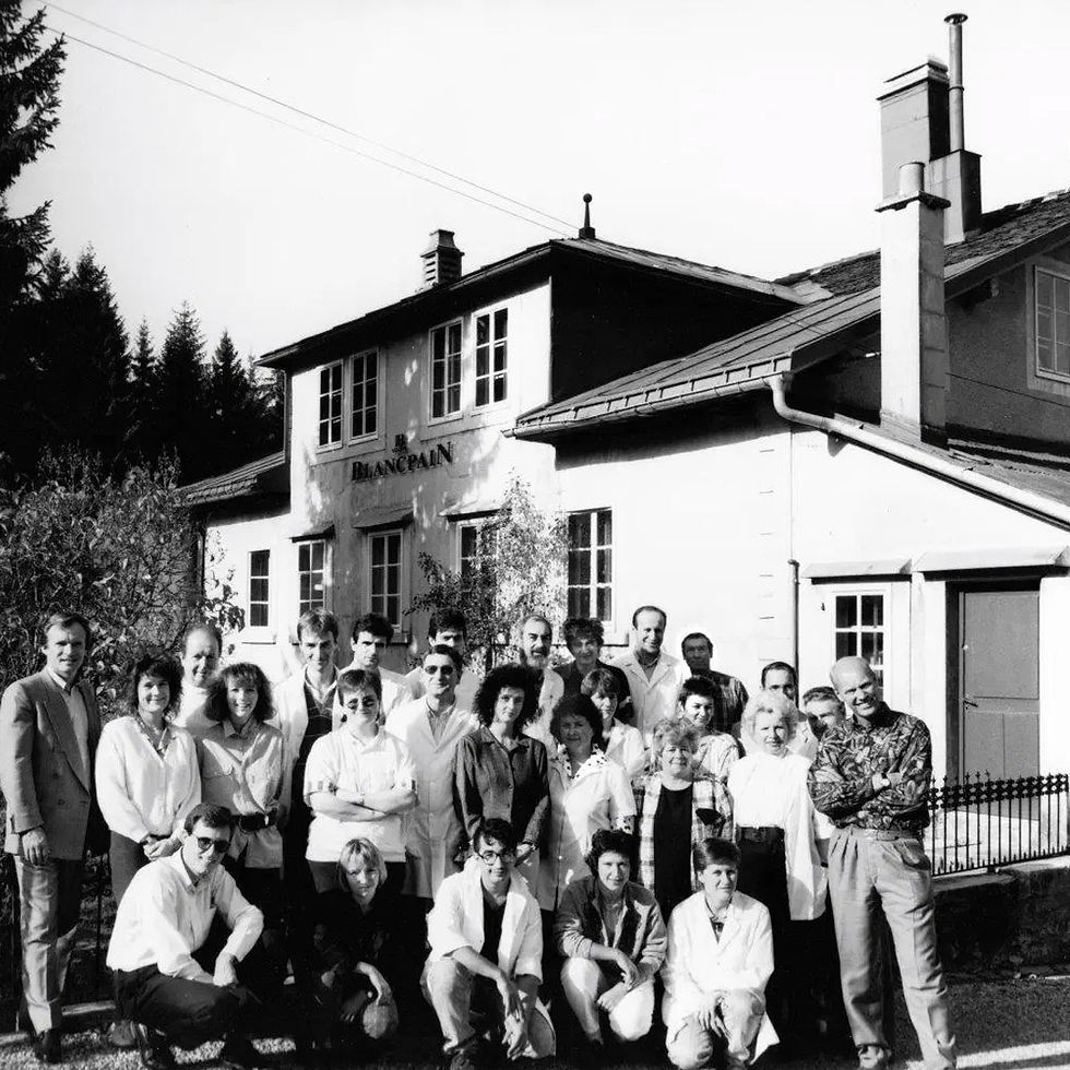
Blancpain’s team in Le Brassus, Vallée de Joux circa 1984. Photo Source: Oracle Time

The watches that emerged during this first revival period were not only important mechanically, they were also experimental. Produced in small quantities and during a time of rapid growth, early Blancpain references reveal a fascinating level of variation that today remains largely undocumented. Among the most interesting examples is the first of the Masterpieces, the Villeret Triple Calendar and their references 6501, 6511, and 6595.


Villeret Ref. 6501


Blancpain Villeret Triple Calendar ref. 6501 introduced in 1983. Photo Source: Europa Star Issue 139 (1983)

While the ref. 6595 is often regarded as the first of Blancpain’s revival-era masterpieces, archival evidence shows that distinction actually belong to the earlier Villeret Triple Calendar ref. 6501. This is further supported by a recent letter from Blancpain, which confirms that the ref. 6501 was the first model introduced following the brand's revival. Introduced in 1983, the 6501 embodied the ultra-thin classical direction Blancpain would become known for throughout the decade.


The 6501 featured a dial with a warm silver sunburst outer section paired with a soft cream-colored center. Combined with the printed black Roman numerals, recessed calendar apertures, and deep blue moonphase display with the now iconic stylized face, the watch feels noticeably warmer and more experimental than the cleaner and more uniform aesthetic typically associated with the 6595. The watch was offered in full gold, two-tone and all-steel with options to buy on a leather strap or with the Gay Feres bracelet.


The watch housed Calibre 64-1, a hand-wound ultra-thin movement finished and modified by Piguet which was based on the Peseux 7001 architecture. The Peseux 7001 featured 17 jewels and operated at a rate of 21,600 vibrations per hour (3Hz frequency). It employed Incabloc for its anti-shock system, with approximately a 42-hour power reserve. In many ways, the 6501 established the blueprint for Blancpain’s revival: thin proportions, traditional complications, and understated elegance.


Villeret Ref. 6511


All-steel Villeret Triple Calendar with automatic movement ref. 6511. Photo Source: Vintage Watches Milano

The ref. 6511 followed shortly after and introduced an automatic movement configuration while maintaining much of the same visual identity. The main identifier of the 6511 as opposed to the 6501 is the inclusion of the cursive text “automatic” on the dial just below the Blancpain logo as seen on its sucessor the 6595. Unlike the later and more regularized 6595, the 6511 appears to belong to an earlier phase where Blancpain was still refining its automatic calendar movement platform.


Blancpain cal. 6511 derived from Omega cal. 711. Photo Source: Europa Star Issue 150 (1985)

The caliber used in the Blancpain 6511 was derived from the Omega cal. 711, a slim automatic movement developed during the late 1960s and 1970s. Known for its compact construction and elegant proportions, the 711 served as a practical foundation for Blancpain’s early revival-era calendar watches before the manufacture transitioned toward the Frédéric Piguet-based calibers seen in the 6595.


Most likely, the Frédéric Piguet automatic movement had not yet been fully developed or industrialized when the 6511 was introduced, leading Blancpain to rely on an existing ultra-thin ébauche during this transitional phase. While Blancpain modified and refined the movement for its own use, the 6511’s caliber reflects the experimental nature of the brand’s early revival years, when external movements were being adapted as the reborn manufacture rebuilt its mechanical identity.


Villeret Ref. 6595


Villeret Triple Calendar watches  with the white dial design. Photo Source: Europa Star Issues 144 and 145 (1984)
Villeret Triple Calendar watches with the white dial design. Photo Source: Europa Star Issues 144 and 145 (1984)

Shortly afterward, in 1984, Blancpain introduced ref. 6501 and 6511 in white dial configuration and in 1987 the ref. 6595, the model that would ultimately become the most widely recognized expression of the revival-era triple calendar.


The white dial configuration features a cleaner and more restrained execution with sharper printing, applied roman numerals and an uniform clean dial with white tones. The result is a dial that feels more modern, refined, and cohesive while still preserving the ultra thin classical elegance that defined early revival-era Blancpain.


The 6595 was powered by the Frédéric Piguet 951 automatic movement, the reference represented Blancpain’s increasingly refined and industrialized direction during the mid-1980s. The FP 951 would go on to become one of the defining calibers of Blancpain’s revival era thanks to its slim architecture, reliability, and suitability for complicated calendar watches.


Villerets with diamond set Gay Frères bracelets. Photo Source: Europa Star Issue 150 (1985).

At the time, the bracelets were rarely offered because most Villeret watches in the late 1980s–1990s were sold on straps. Gold bracelets were slightly more common because they matched the luxury cases and were a popular upgrade. Steel bracelets and diamond set bracelets were likely mostly special orders for collectors who wanted those specific configurations. For a more detailed overview of the 6595 and breakdown of its variations by reference numbers, I highly recommend visiting Watch Brothers London website.


For the construction and design of the Villeret bracelets, Blancpain chose none other than one of the greatest bracelet makers of its era: Gay Frères.


The Bracelet Maker


Gay Frères Advertisement. Photo Source: Europa Star Asia Issue 213 (1986).

Founded in Geneva in 1835, Gay Frères became one of the most important bracelet manufacturers in Swiss watchmaking history, supplying bracelets to some of the industry’s most prestigious maisons throughout the 20th century, including Rolex, Patek Philippe, Audemars Piguet, Vacheron Constantin, and of course Blancpain. Renowned for its high-quality metalwork, jewelry craftsmanship, complex integrated bracelet designs, and refined finishing techniques, the company established itself by the 1970s and 1980s as the benchmark for luxury bracelet production, creating iconic designs such as the Rolex Oyster and Zenith ladder bracelets, as well as numerous integrated sports-watch bracelets during the post-quartz era.


During Blancpain’s early revival period in the 1980s, Gay Frères produced the intricate bracelets fitted to references such as the 6501, 6511, and 6595—bracelets that today reveal a surprisingly complex evolution in construction, and finishing as the reborn manufacture gradually transitioned from experimental low-volume production to a more industrial phase.


All-steel Villeret ref. 6501 along with ref. 6595 with their respectives Gay Frères bracelets. Photo Source: @odetochronos Instagram

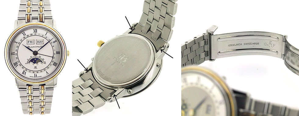
The bracelet construction was built around brushed flat outer links that are sharply chamfered, contrasted by a pair of narrow central cylindrical polished elements. This geomety gives the bracelet a more technical and almost industrial appearance despite the watch’s otherwise classical aesthetic. The alternating brushed surfaces and polished cylindrical center elements add depth and light play without relying on excessive ornamentation. In the two-tone variation of the bracelet, the pair of cylindrical elements included an additional polished gold bar in the center. The bracelets also featured both Blancpain engraved stamp along with Gay Frères head of a chamois goat flanked by the initials "G" and "F".


After creating a dataset and analyzing multiple known examples to the market, a remarkably coherent bracelet evolution began to emerge. Early bracelets, generally found on lower serial pieces feature chamfered links and the most important identifier: an indentation on the end links. These indentations likely existed on the earlier production bracelets to allow a slight degree of “play” between the bracelet and the case, as manufacturing tolerances were probably more difficult to achieve consistently during the production early stages.


Two-tone ref. 6501 showing early example of Gay Frères bracelet with "indentations" in the end links. Photo Source: GRAILIUM

Another observation made with both earlier and later samples is that the clasp branding engravings are shown inconsistently between the bracelets. Some clasps are signed simply “JB 1735,” while others have a "JB 1735 with "Blancpain" branding below, with no strict chronological pattern. However, one detail does evolve consistently with close examination: the typography itself. Early bracelets with indentations in the end links that display a slightly larger, “JB 1735” + "Blancpain" engraving, while later bracelets observed in ref. 6595 adopt a smaller and tighter execution.


Clasp engravings vary across the different bracelets. On the left a two-tone with chamfered links and "JB 1735" engraving and on the right an all-steel bracelet with rounded links and "JB 1735" & "Blancpain" engraving  Photo Source: @liv.lif.lov Instagram post
Clasp engravings vary across the different bracelets. On the left a two-tone with chamfered links and "JB 1735" engraving and on the right an all-steel bracelet with rounded links and "JB 1735" & "Blancpain" engraving Photo Source: @liv.lif.lov Instagram post

Around the ~650–700 serial range, a major transition appears to occur. The indentation in the end links begin disappearing in favor of a flatter bracelet integration that would become characteristic of later production. Initially, these flat end link bracelets still retained chamfered links, but later examples introduced a rounded-link refinement that appears more frequently in higher serial ranges and precious metal executions although it is also existent in all-steel. Interestingly, the rounded-link design never fully replaced the earlier chamfered style, suggesting both variants coexisted during the later years of production.


Ref. 6595 without the end links indentation and "JB + 1735" clasp engraving. Photo Source: The Meticulist

Perhaps the most surprising discovery is that bracelet evolution does not appear to be reference-specific. Late examples of the 6501 and 6511 share the same bracelet characteristics as the 6595, including flat end links, in some samples rounded links, and smaller “JB 1735” engravings. This could challenges the assumption that flat end link bracelets on 6501 and 6511 references are necessarily later service replacements. In many cases, they may instead represent factory-original late-production examples created during Blancpain’s broader transition toward more uniform manufacturing practices.


Conclusion


One important takeaway from the data I analyzed is that early 6501 and 6511 examples fitted with Gay Frères bracelets feature the characteristic indented end links, whereas later examples of these references as well as the 6595, transition to a flatter end-link construction, reflecting Blancpain’s gradual move toward a more standardized bracelet architecture during the revival era.


The 6501, 6511, and 6595 were not isolated chapters, but overlapping stages within Blancpain’s rebirth one where movements, bracelet construction, engraving techniques, and finishing details evolved gradually rather than all at once. More than forty years later, these small details continue to reveal just how dynamic and experimental the early revival era truly was.


Will the Gay Frères bracelets made for Blancpain’s Villeret line ever command the same prices as a Wellendorff bracelet? Perhaps not and honestly, that is not what matters most. What truly matters is that these bracelets are finally recognized for what they are: beautifully engineered creations born during one of the most fragile and fascinating periods in modern horological history. They deserve their proper place within the story of Blancpain’s revival and within the broader conversation surrounding great bracelet design.


And perhaps that raises an even more interesting question: should Blancpain bring these bracelets back for the modern Villeret collection? Personally, I would love to see it happen.


Special thanks to @liv.lif.lov and @alewatches for their assistance with my research!


Updated: 3 hours ago


To understand the Vacheron Constantin 333, one first has to understand the watch that came before it.


In 1977, amid the height of the quartz crisis, Vacheron Constantin introduced the 222 to celebrate the manufacture’s 222nd anniversary. Designed by Jörg Hysek, the watch marked a dramatic departure from the classical dress watches that had long defined the maison. It embraced the emerging language of luxury sports watches with an integrated bracelet, angular case architecture, notched bezel, and monobloc construction. Vacheron Constantin seemed less interested in preserving a strict formula than in exploring what modern luxury could look like during one of the most turbulent periods in Swiss watchmaking history.


By the early 1980s, the industry had shifted again. Quartz had evolved from existential threat into accepted commercial reality, while consumer tastes increasingly favored slimmer cases, jewelry-inspired aesthetics, and highly stylized integrated designs. At the same time, the seeds of the coming mechanical revival were quietly beginning to emerge. It was within this atmosphere of uncertainty that the 333 appeared, officially debuting at the 1984 Basel fair.


Vacheron Constantin 333 released in Basel 84. Photo shows an early Ladies 333 example with dauphine hands and no markers.  Photo Source: Europa Star
Vacheron Constantin 333 released in Basel 84. Photo shows an early Ladies 333 example with dauphine hands and no markers. Photo Source: Europa Star

And unlike the 222, whose name directly referenced Vacheron Constantin’s anniversary, the “333” designation remains oddly mysterious. The manufacture was nowhere near 333 years old when the watch was introduced, making the name feel almost arbitrary. In many ways, that ambiguity perfectly reflects the watch itself. The 333 feels like a model suspended between identities: part luxury quartz statement, part mechanical sports watch, and entirely representative of the uncertainty that defined Swiss watchmaking during the mid-1980s.


Physically, the 333 retained much of the integrated design philosophy established by the 222 while softening and refining the overall execution for the 1980s. The watch featured a slim octagonal-shaped case subtly inspired by the Maltese cross, flowing seamlessly into its integrated bracelet. Compared to its predecessor, the profile was smoother, rounder, and more restrained. Adding to the watch’s unconventional character was the oddly positioned date window at 9 o’clock a detail that still feels slightly unexpected even today.


At approximately 33mm in diameter, the watch occupied an unusual middle ground: neither a traditional dress watch nor a true sports watch by modern standards. The bracelet itself became one of the defining visual elements of the reference, featuring polished center hexagonal links that varied in color depending on the configuration.


Quartz VC 333 in Platinum with stick hands and baton markers. Photo Source: The Keystone

Quartz models (Reference 73001/946) were typically powered by Vacheron Constantin’s ultra-thin quartz calibers, emphasizing slimness and elegance, while Automatic examples (Reference 46007/946) housed the Calibre 1124/1 derived from the legendary Jaeger-LeCoultre Calibre 889, one of the most respected thin automatic movements of the era. That movement choice alone suggests Vacheron Constantin still viewed the automatic variants as serious horological offerings despite the dominance of quartz during the period.


VC Calibre 1124/1  derived from the JLC 889. Photo Source: Everywatch
VC Calibre 1124/1 derived from the JLC 889. Photo Source: Everywatch

To better understand the reference, I began compiling a dataset of known examples that have surfaced publicly on the market. The dataset tracks serial numbers, metals, movement types, dial configurations, handsets, bracelet details, and known sales data. Known examples span stainless steel, yellow gold, platinum, and two-tone executions, alongside diamond-set variants, quartz and automatic movements, and dramatically different dial and handset combinations. The result is a reference with two distinct personalities existing simultaneously.


One side of the 333 leaned heavily into the language of 1980s luxury. These examples were typically quartz-powered and executed in gold, platinum, or jewelry-oriented configurations. Their styling was restrained and elegant, featuring thin stick hands, minimalist markers, and champagne or silver dials. Today, collectors often view quartz through the lens of compromise, but during the mid-1980s it represented modernity, precision, and sophistication.


 VC Product Catalog with U.S. Retail price in 1988. Photo Source: Vacheron Constantin
VC Product Catalog with U.S. Retail price in 1988. Photo Source: Vacheron Constantin

For many Swiss maisons, quartz was not seen as the abandonment of watchmaking tradition, but rather as the future of luxury itself. Viewed through that context, these precious-metal 333s begin to resemble the final expression of a distinctly 1980s idea of refinement: slim, decorative, technologically modern, and unapologetically contemporary.


At the exact same time, however, Vacheron Constantin was building something entirely different. A second category of 333 emerges clearly within the data: stainless steel automatic examples with luminous baton markers, luminous hands, darker dials, and far more assertive sport-oriented aesthetics. Most importantly, these configurations appear surprisingly early in the production timeline. That distinction matters because it suggests the 333 was never evolving from dressier watch into sports watch. Vacheron Constantin was pursuing both ideas simultaneously.


All-Steel 333 with grey dial and luminous batons. Photo Source: Touch of Modern

The dataset also hints at another important divergence. Quartz examples appear to dominate overall production, particularly among precious-metal and jewelry-oriented references, while automatic examples seem concentrated primarily in steel and two-tone sport configurations. Yet modern collector preferences have increasingly reversed those priorities. Steel automatic examples now command the strongest attention, with gray-dial automatic variants already achieving significantly stronger prices than their quartz counterparts despite the likely greater rarity of some precious-metal executions.


Complicating matters further is the fact that Vacheron Constantin has never publicly clarified production figures for the 333. Collector lore has long suggested that approximately 600 examples were produced in total, with perhaps only around 200 automatic models manufactured across all metals. Whether those figures are fully accurate remains impossible to verify at present, but the surviving market data does support the broader idea that automatic examples were produced in significantly smaller quantities than their quartz counterparts.


Vacheron Constantin 333 Adverstisement circa 1988. Photo Source: Vogue Magazine

This is perhaps what makes the 333 so historically fascinating. The watches that likely represented the future of luxury during the 1980s — the quartz models now feel the most period-specific. Meanwhile, the mechanical steel sport variants, which may have represented a smaller and less commercially important segment at the time, have become the configurations modern collectors gravitate toward most strongly.


Ultimately, the significance of the 333 may have more to do with timing than anything else. Few watches capture the contradictions of the mid-1980s Swiss watch industry so clearly. The model exists at the intersection of quartz optimism, mechanical uncertainty, integrated sports-watch experimentation, and shifting ideas of luxury itself. It is neither fully dress watch nor fully sports watch, neither fully quartz statement nor fully mechanical revival. Instead, the 333 became something far more revealing: a snapshot of a manufacture attempting to navigate two futures simultaneously.


And perhaps that is why the 333 feels increasingly relevant today. Not because it was trying to become the next 222, but because it quietly documented the precise moment when the industry itself no longer knew what came next.


Will Vacheron Constantin ever recognize the 333 as more than a forgotten experiment and ultimately revive the design within a new contemporary collection? Perhaps one day. The irony is that the manufacture will not reach its 333rd anniversary until 2088 still decades away. I likely will not be here to witness it, but with a bit of luck, my daughter will and maybe by then the watch will finally receive the recognition it quietly deserved all along.


bottom of page